Intuit Proactive interventions
How I reduced DIY filer abandonment by 14% and increased contextual help engagement from 12% to 18% across 45M+ TurboTax users.
- Configurable component system shipped across TurboTax, QuickBooks, and Mint
- Product vision and phased UX roadmap
- Proactive intervention self help solution for over 45 million users

About turbotax
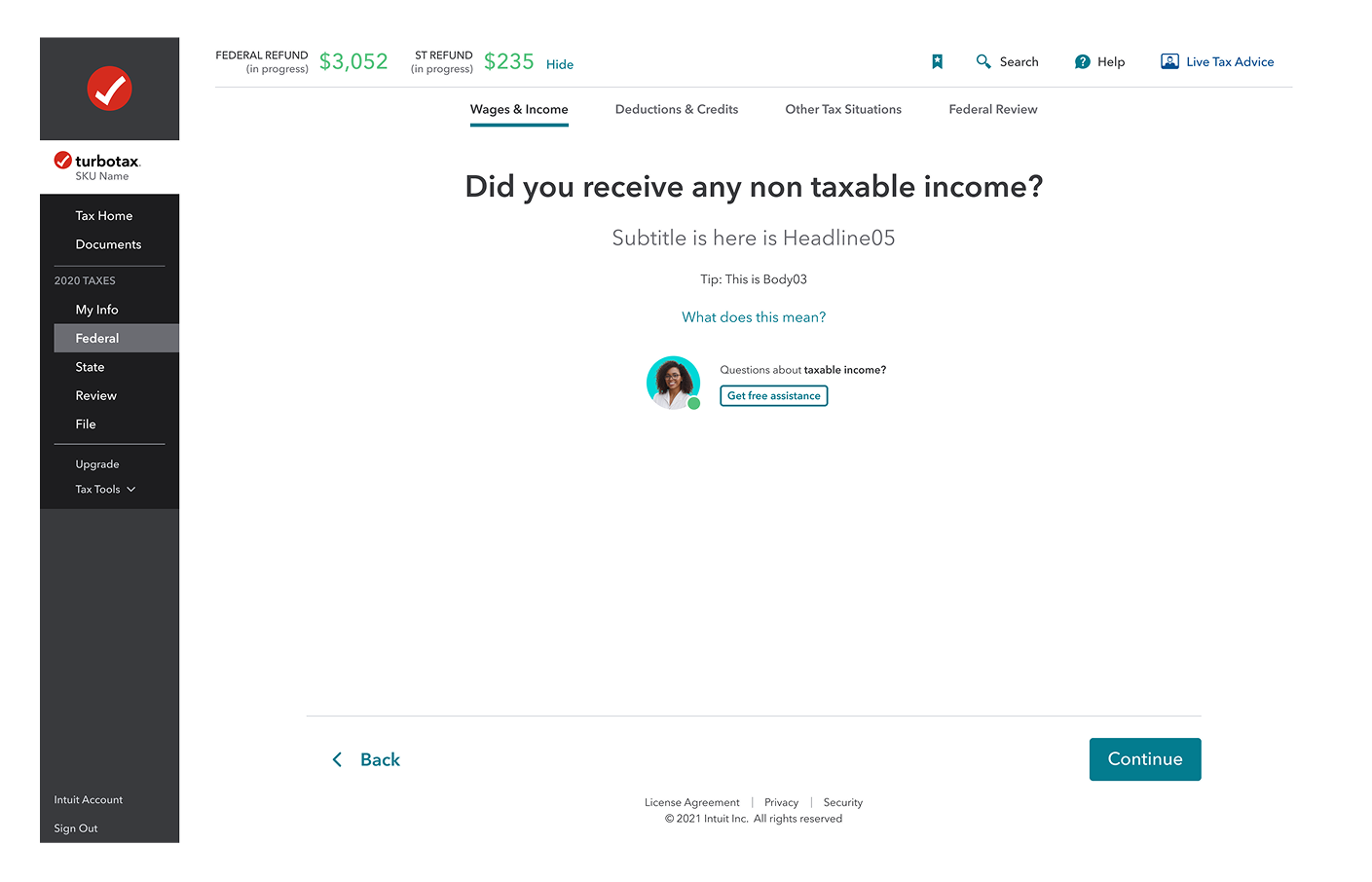
TurboTax DIY is a guided, interview-style tax preparation platform designed to help individuals and small businesses file their own taxes without needing professional tax knowledge.
My role
As a the UX lead on this project, I defined a brand new framework around proactive interventions to connect DIY turbo tax customers to chat agents. I partnered with the Virtual expert platform to create the product vision, led journey mapping to discover friction, and deliver a new component experience that increased engagement from 12% to 18% and reduced abandonment by 14% across 45M+ DIY filers.
Shipped contributions
Mobile web intervention
Help panel intervention
Shovel ready components
Inline experience
Results & Impact
We defined success before shipping: contextual engagement above 15% and a measurable reduction in flow abandonment. Each result maps back to a specific LOFA we tested. Here's what we found.
14% abandonment reduction tracks directly to 18% engagement lift. Users who engaged with contextual help were less likely to drop off.
14%
Reduced abandonment
Among DIY TurboTax filers who engaged with proactive interventions during filing.
At TurboTax's scale, 14% fewer drop-offs among engaged users = millions more completed returns.
18%
Engagement increase
Contextual help engagement when surfaced at the right moment in the user workflow.
45M+
Users impacted
Scalable proactive intervention system deployed across the TurboTax DIY experience.
+26%
Confidence score
Improvement in self-reported user confidence for customers who received contextual help.
Confidence is the strongest predictor of return-to-file rate the following year.
The problem space
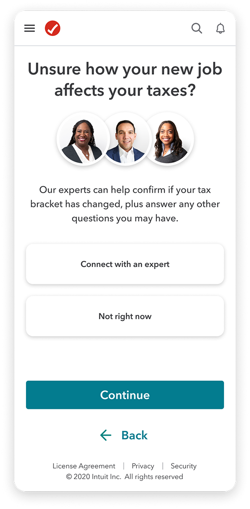
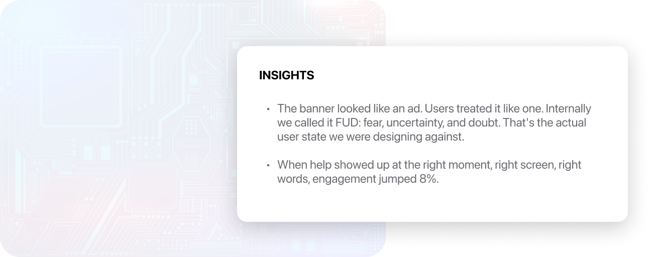
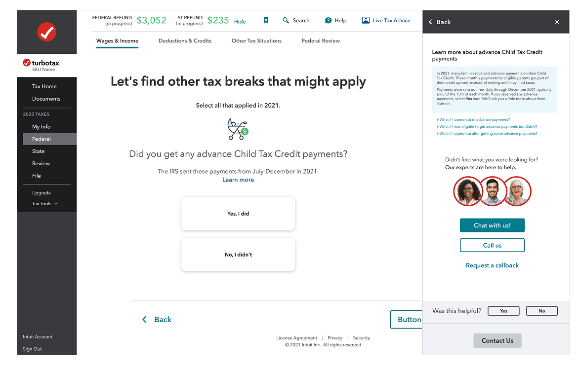
TurboTax's previous proactive help experience relied on static banners in the tax flow, with the intent of connecting paid users to tax agents that would provide free guidance on specific tax situations. As a result, users often ignored or distrusted these product offerings, resulting in low engagement and high abandonment rates.
However, previous experiments showed that when help was surfaced with the right content, timing, and placement, engagement jumped from 12% to 18%.
INSIGHTS
- •
The banner looked like an ad. Users treated it like one. Internally we called it FUD: fear, uncertainty, and doubt. That's the actual user state we were designing against.
- •
When help showed up at the right moment, right screen, right words, engagement jumped 8%.
My Strategy
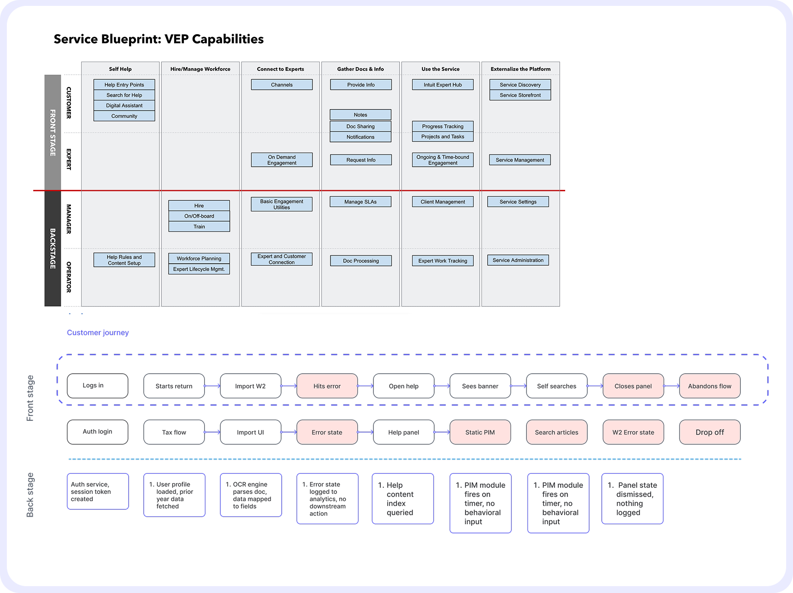
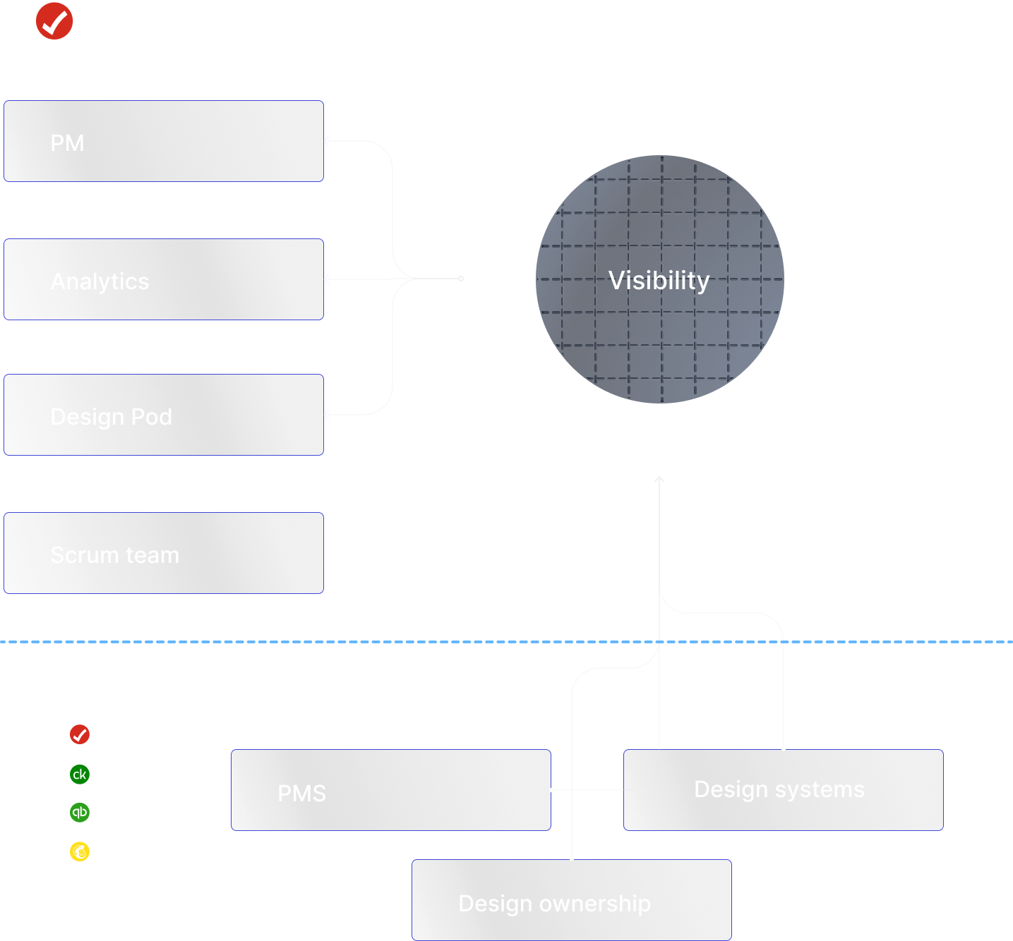
Before designing anything, I needed to understand the where our capability lived in our product offerings. I started by auditing the existing VEP service blueprint across multiple scrum teams to identify where design ownership overlapped and where gaps existed.
From there I mapped the end-to-end customer journey, tracing the broken path from login to abandonment to pinpoint exactly where trust broke down. Using clickstream data, I identified hesitation signals — loops, stalls, time on page, repeated back-and-forth navigation and worked with analytics to build abandonment scores.
Collaboration
This project required coordination across multiple teams with overlapping ownership and competing priorities. I worked on a weekly cadence with my PM and data analytics to track experiment results and align on priorities, using clickstream data to drive design decisions rather than assumptions. As the scope expanded beyond our scrum team, I proactively brought in design leads, PMs, and design systems owners from TurboTax, Credit Karma, and QuickBooks who had ownership over touchpoints the intervention system needed to reach.
That cross-functional work was essential — the component system had to scale across products we didn't own, and the trigger logic touched parts of the platform owned by teams we weren't originally partnered with. Getting alignment early meant we could ship a shared solution instead of a one-off.
Wireframing
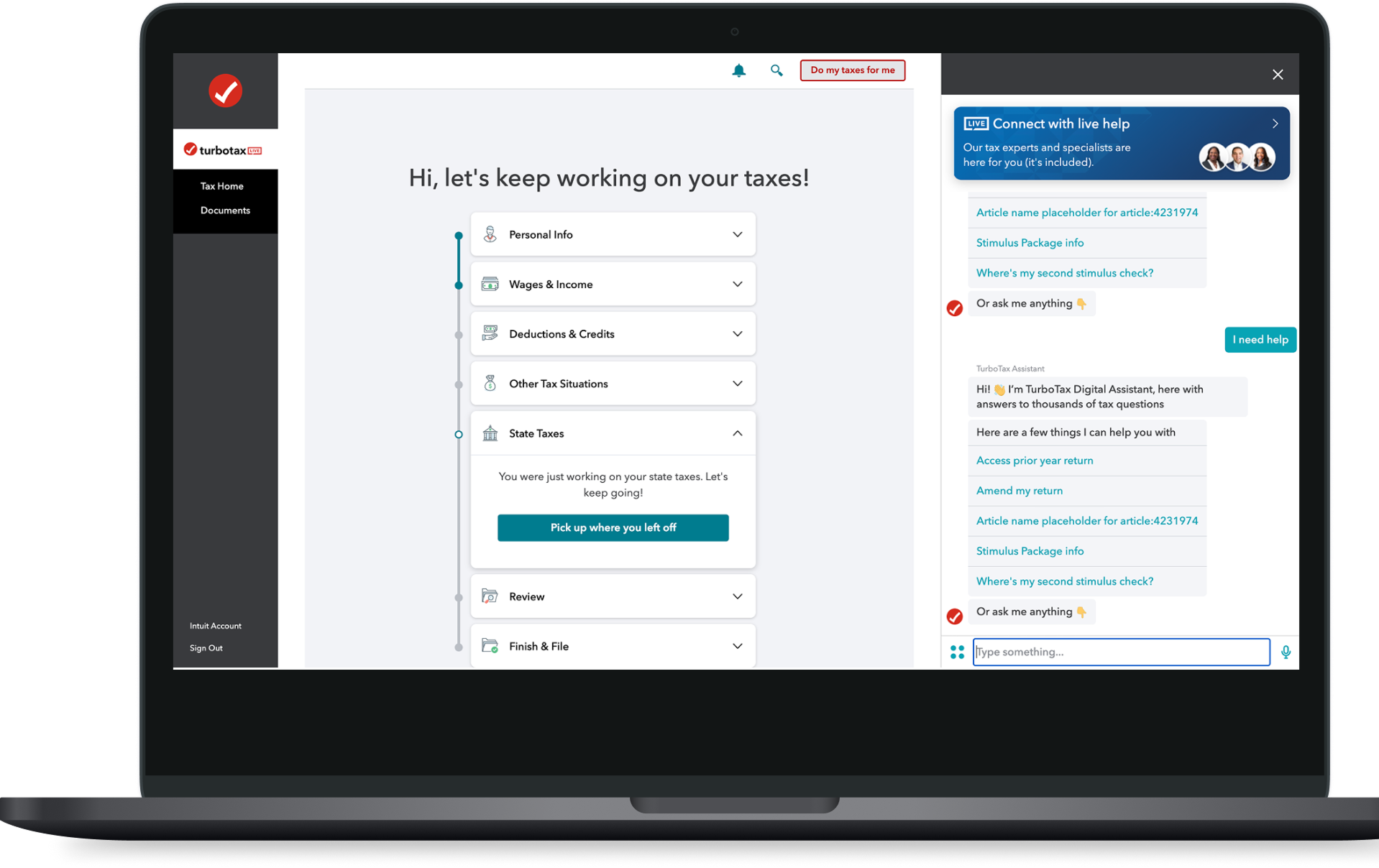
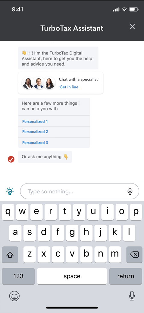
Early wireframing focused on exploring the full solution space before committing to a direction. I tested existing platform capabilities like the TurboTax digital assistant as a pre-made intervention vehicle, then pushed further into new concepts: custom PIM card designs with contextual messaging, and different access models for surfacing help, including persistent floating action buttons and badge-based entry points. The goal was to stress-test each pattern against the core problem of trust and timing before any visual design decisions were made.

Turbotax digital assistant as a pre made solution
Persistent FAB access vs Badges
Visual design and prototyping
With the strategy and wireframes validated, I moved into high-fidelity visual design. The goal was to create a system of intervention components that felt native to TurboTax while being flexible enough to scale across different products and contexts.
I designed multiple variants for desktop, mobile app, and mobile web to ensure consistency across all touchpoints where users might need help.
Desktop
Mobile web
FAB explorations
FAB explorations


DEVELOP: Going Broad on Solutions
How Might We Design For Scalability Across Intuit?
Before coming up with design solutions, I consulted with the Intuit design system resources. I took an inventory of use cases across the platform to see how we could re-use existing components, and avoid design system inflation.

How Might We Increase Credibility In The Moment?
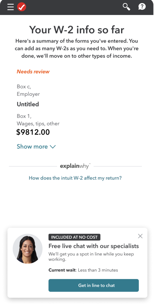
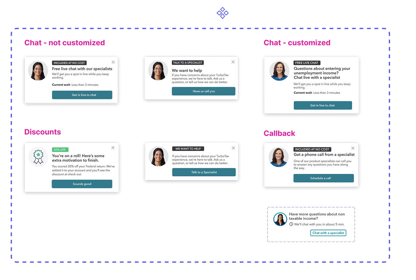
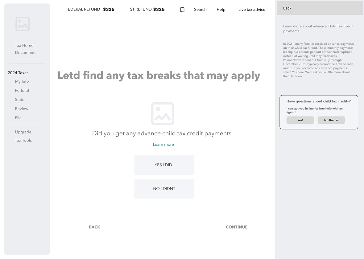
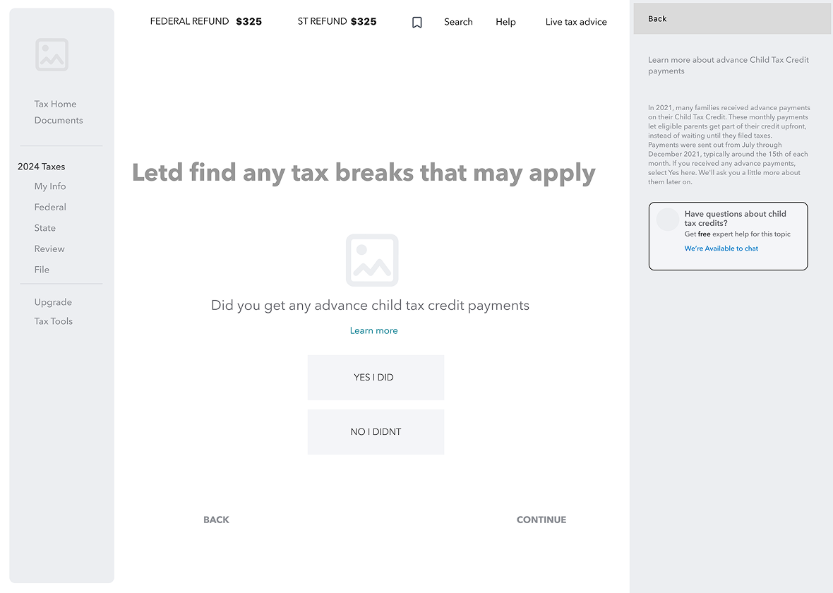
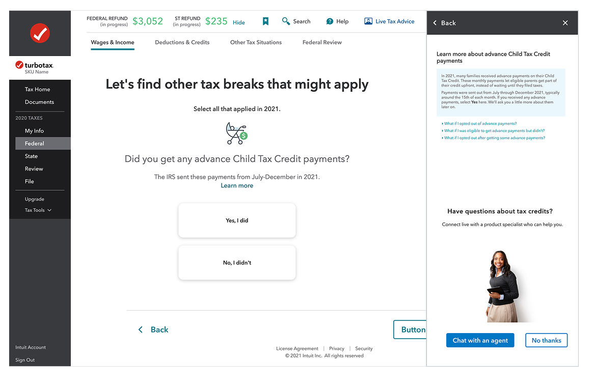
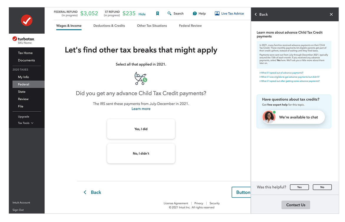
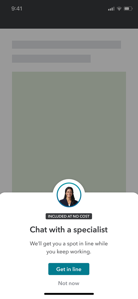
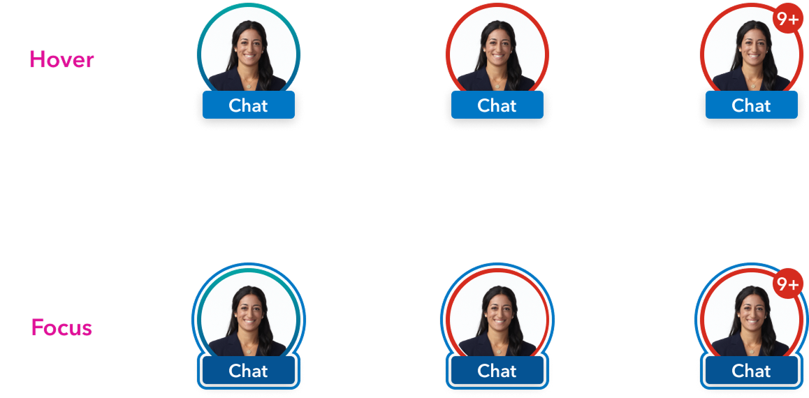
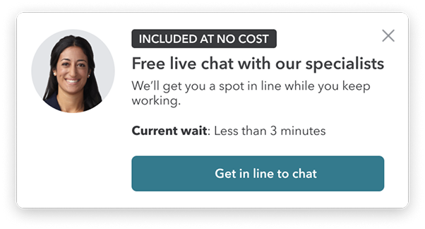
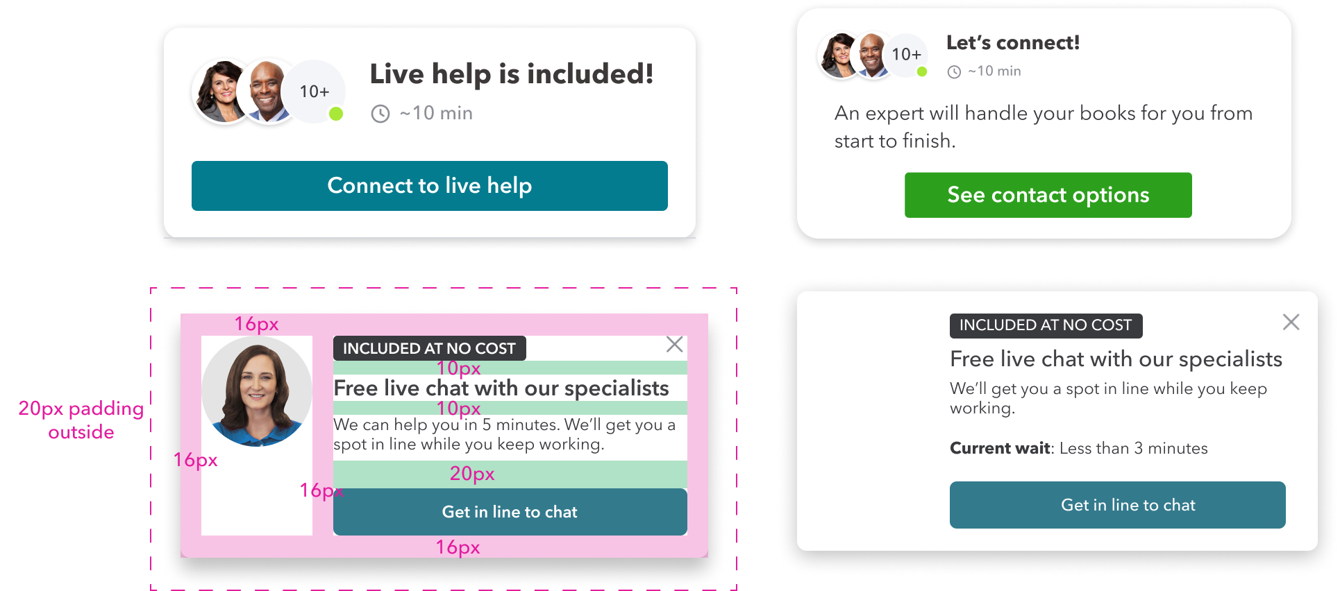
With the card pattern set, I tested variations: agent avatars, availability indicators, "Included At No Cost" messaging, and clear CTAs. The goal was a flexible framework that supports different intervention moments while staying consistent with IDS.
DELIVER: Rapid Experiments in Context
Content Strategy: How Might
We Apply Context?
Hypothesis
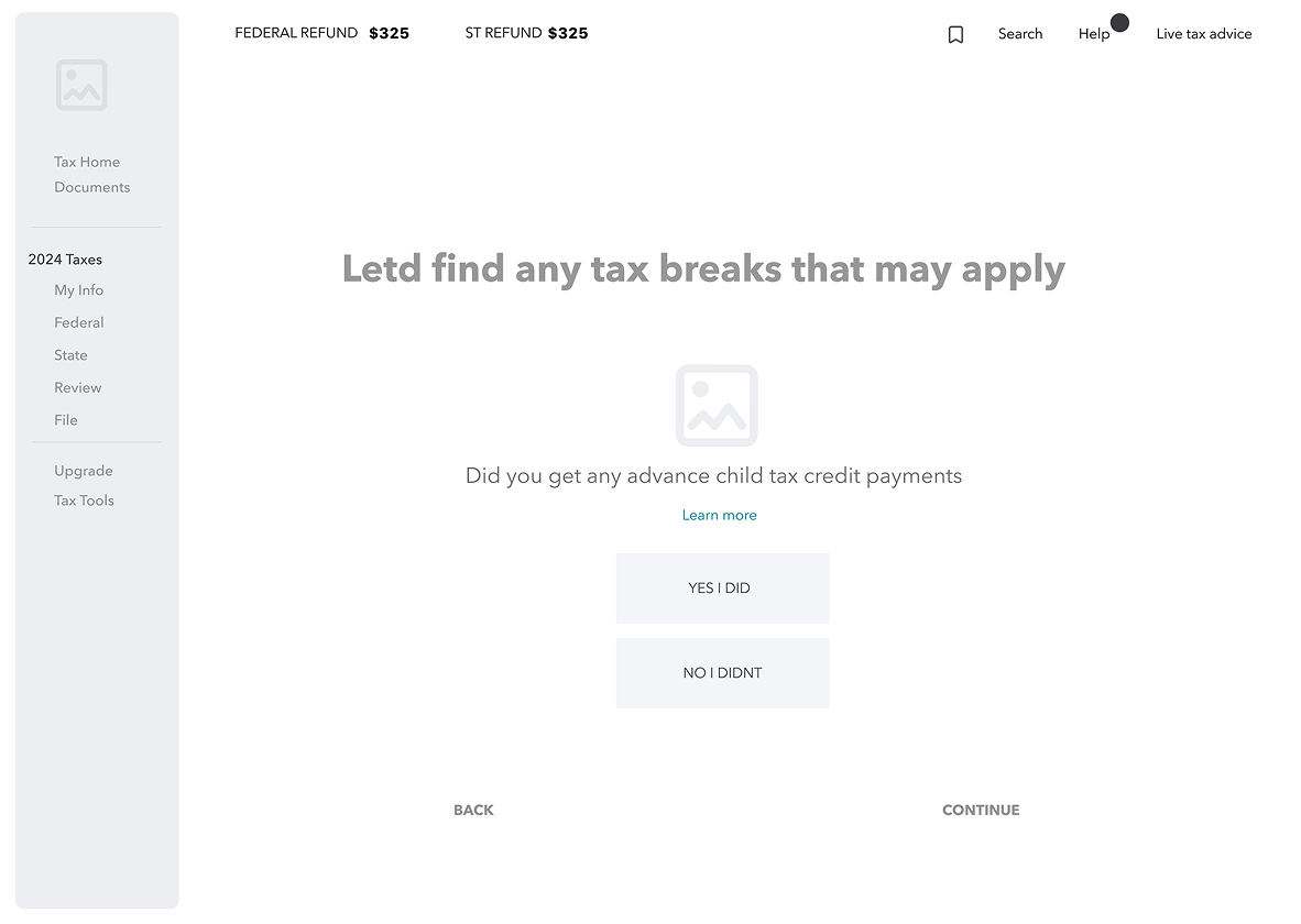
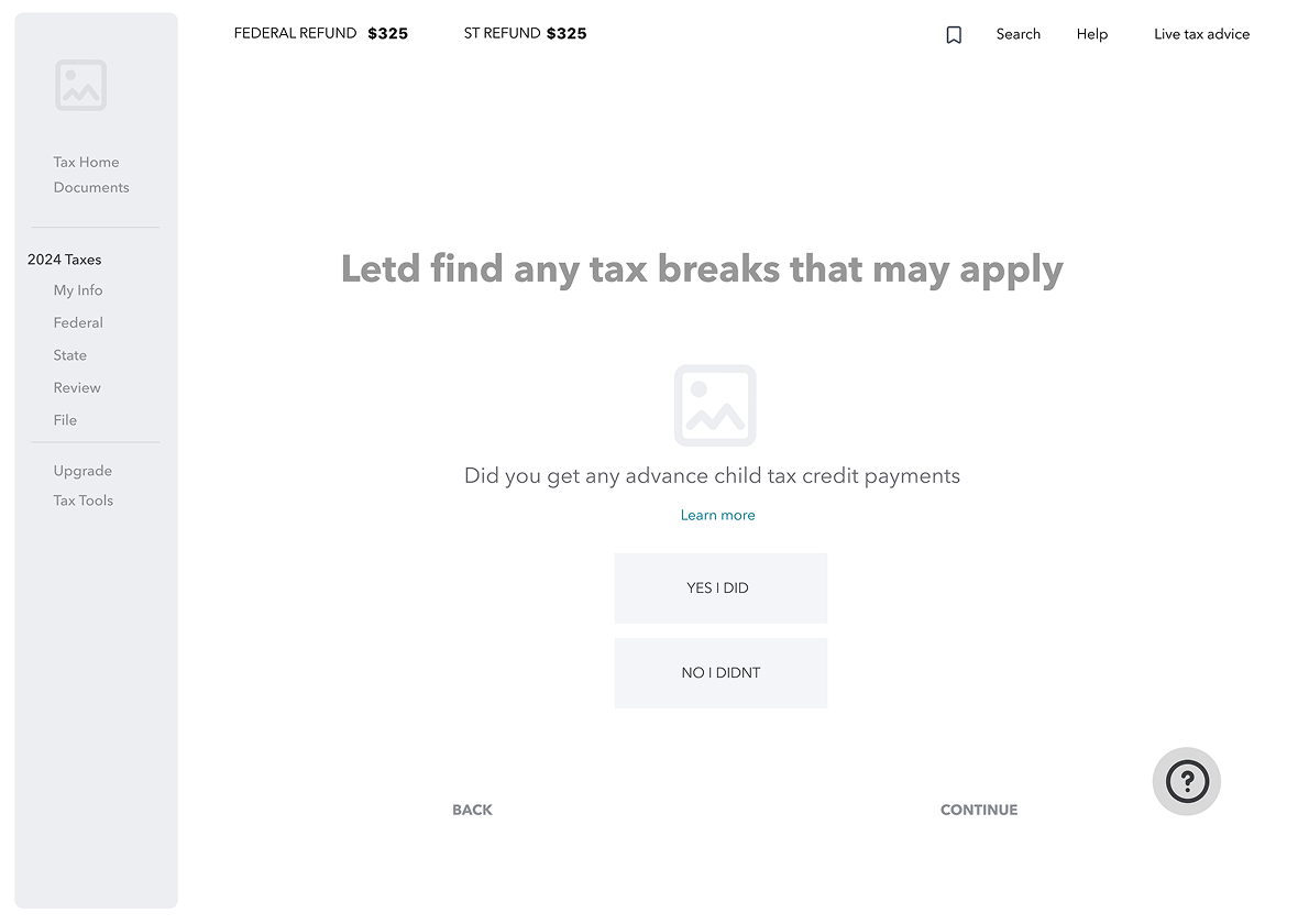
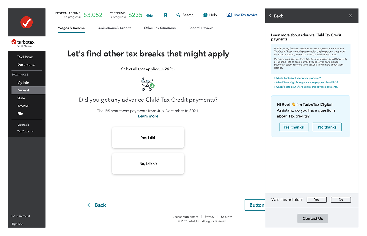
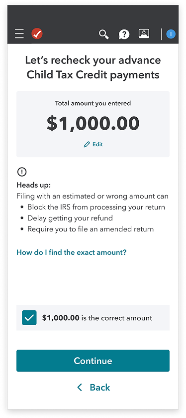
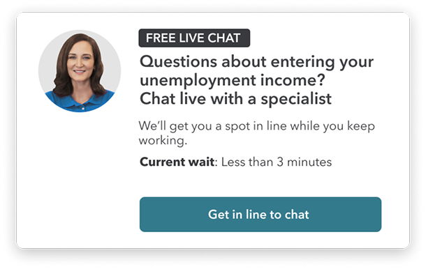
If we surface a contextual card after two failed W2 import attempts, users will engage with expert help rather than abandon, measured by intervention engagement rate on the W2 trigger specifically. Success = engagement above 15% on triggered sessions.
W2 Import
New Customer risk: HighTechnical errors or mismatched data during import make users doubt the software's accuracy, leading to "fear of the IRS" abandonment.

Content Goal: Reassurance and technical resolution.
- •Contextual Trigger: Trigger after two failed import attempts or if the user stays on the "Review your W-2"page for >90 seconds.
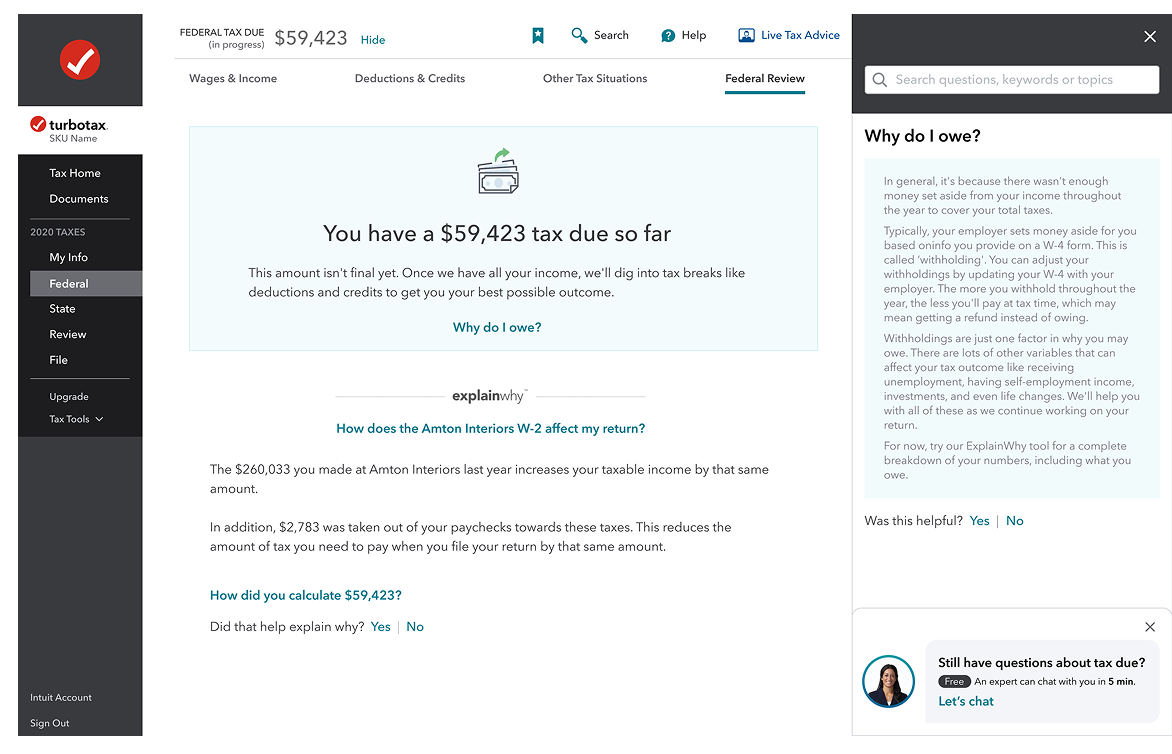
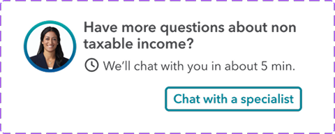
Refund amount
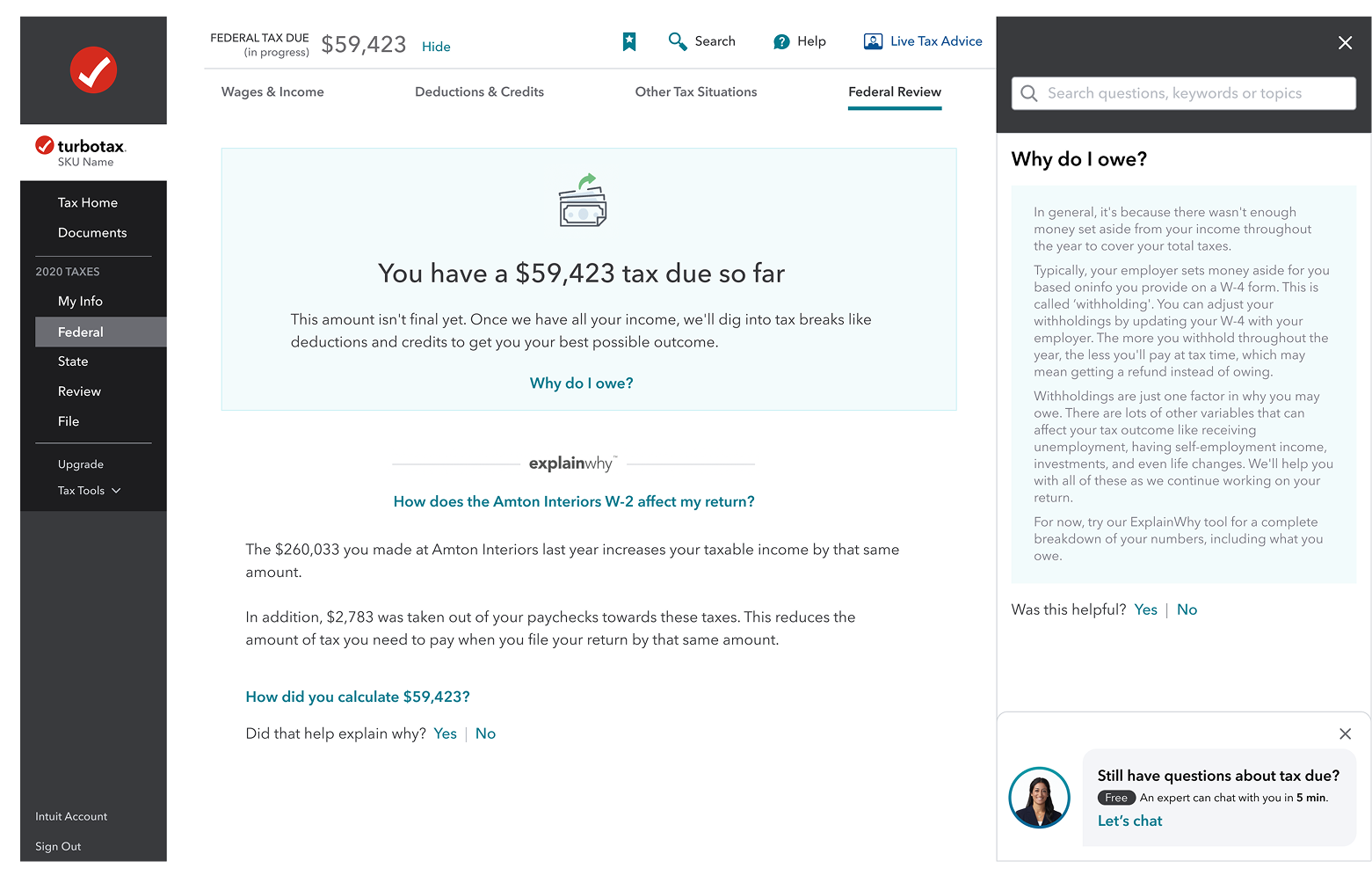
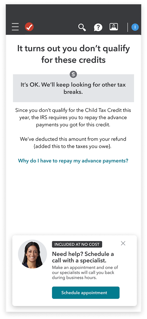
Existing Customer risk: HighUsers often abandon when the refund is lower than expected or the tax due amount is shockingly high.

Content Goal: Explain the "Why" and pivot to "What's Next."
- •Contextual Trigger: Trigger when the "Tax Due" or "Refund"amount is first displayed, or if the user clicks "Why is my refund lower?" multiple times
After hours
Lost Customer risk: HighUsers working late feel alone. If they hit a wall when experts aren't live, they close the tab and often never come back.

- •Content Goal: Set expectations and secure a "save for later" commitment.
- •Contextual Trigger: Trigger automatically when a user spends significant time on a complex section (like Business Income) outside of live-chat hours
What We Shipped
Q3: We shipped a behavior-triggered intervention system for three high-risk moments: W2 import failures, refund volatility, and after-hours abandonment.
Hesitation signals (repeated imports, refund confusion, late-night sessions) trigger contextual support. Messaging, tone, and escalation path adjust based on user state.