Case Study

Callara Skincare AI onboarding
Built with
 Figma
Figma Claude
 Cursor
 GitHub
 React
React TypeScript
Overview
Callara is an AI skincare startup based in Japan with a target market of U.S. consumers, and a forecasted valuation of $2M MRR by next quarter. Callara's founders reached out to me for fractional design help with their prototype to help secure seed funding.
I designed and led the entire AI and UX strategy for Callara's onboarding, resulting in a 67% increase in product input and a 98% increase in users completing skin profile analysis. I delivered a robust prototype and automated a design-to-code pipeline with LLM tools before deploying the live code to the repo.
What I shipped
Scroll to explore the full flow, from onboarding through the core experience.
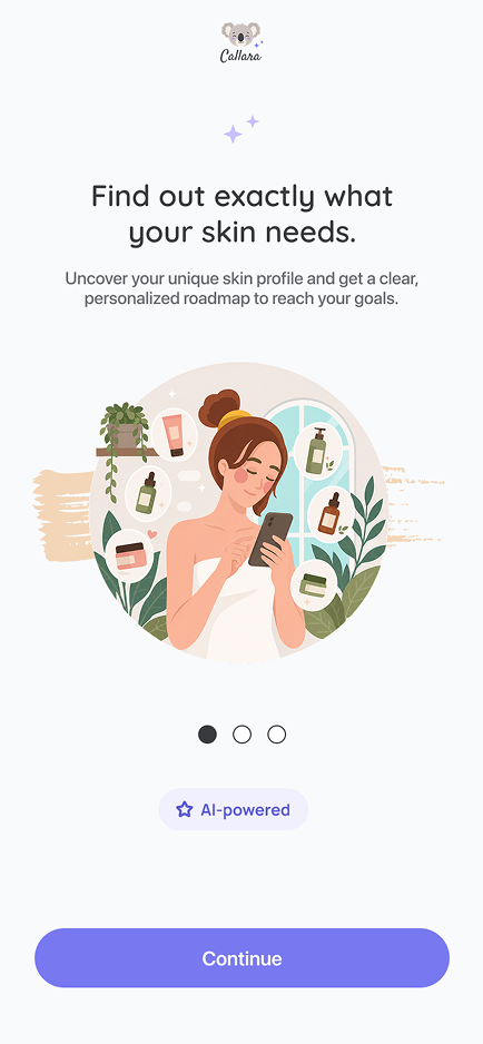
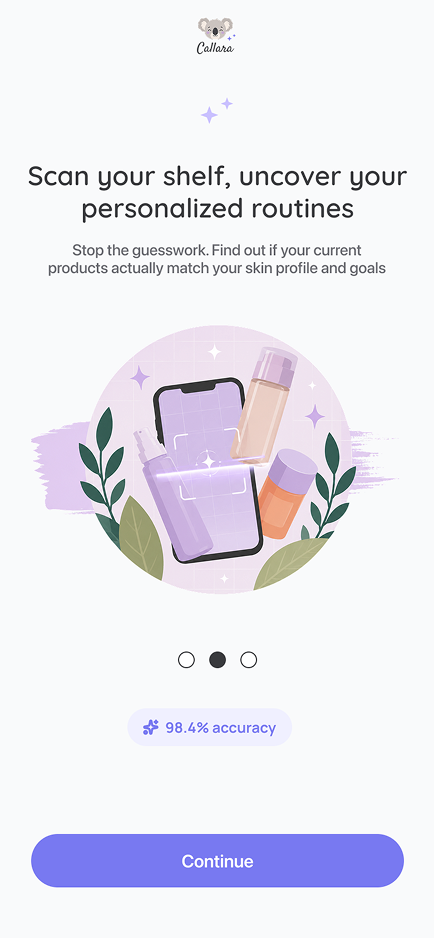
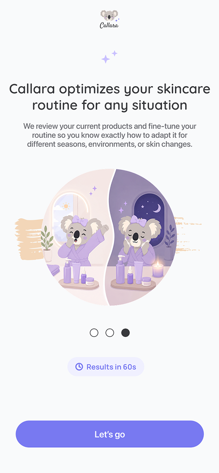
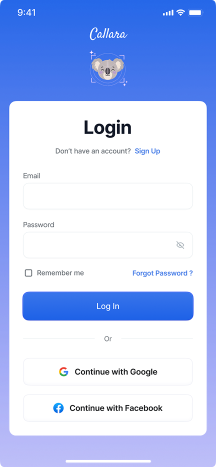
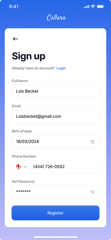
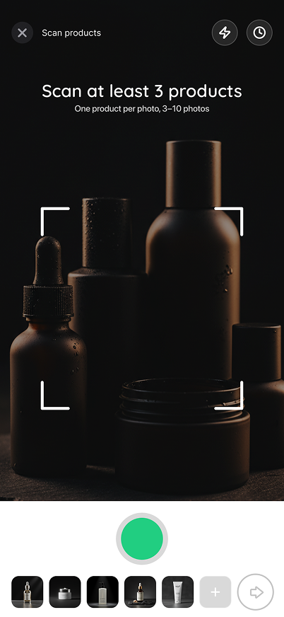
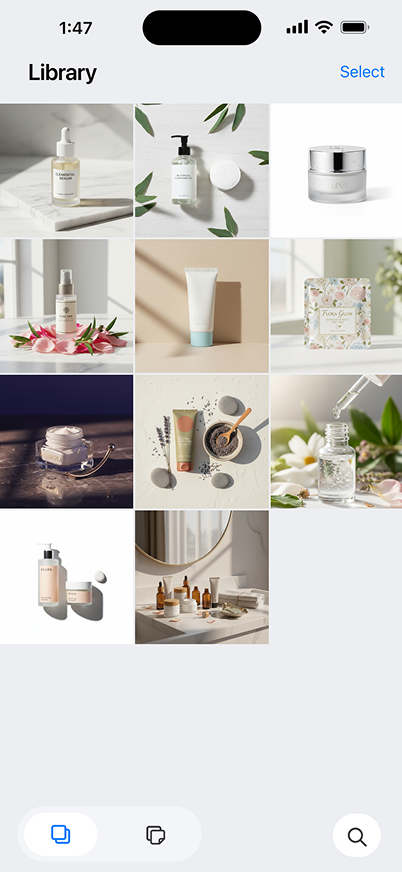
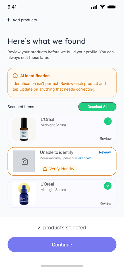
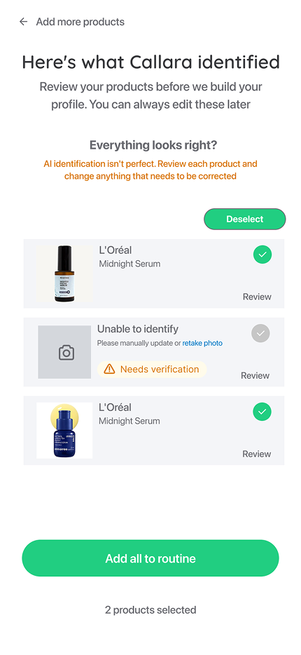
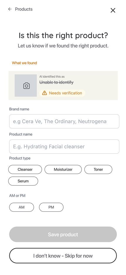
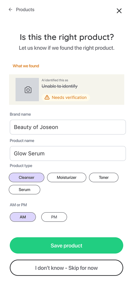
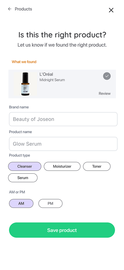
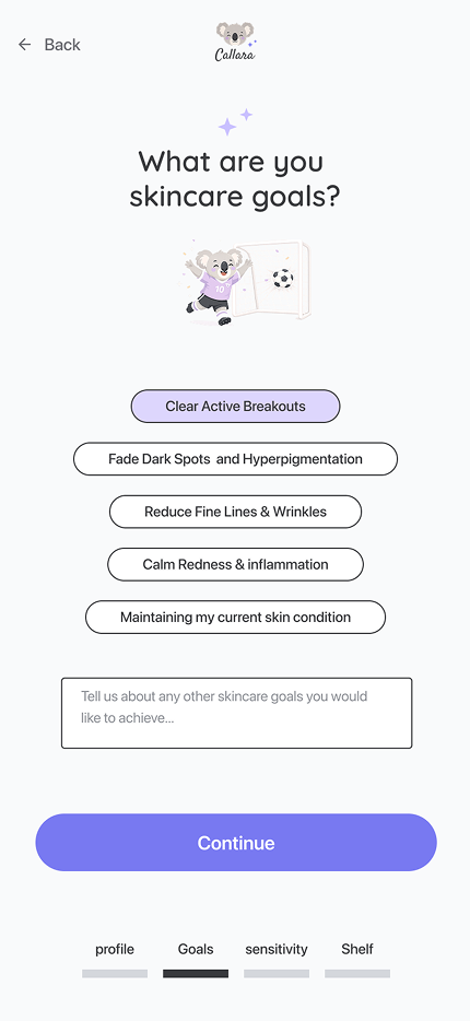
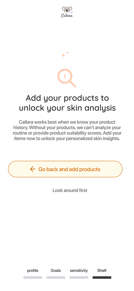
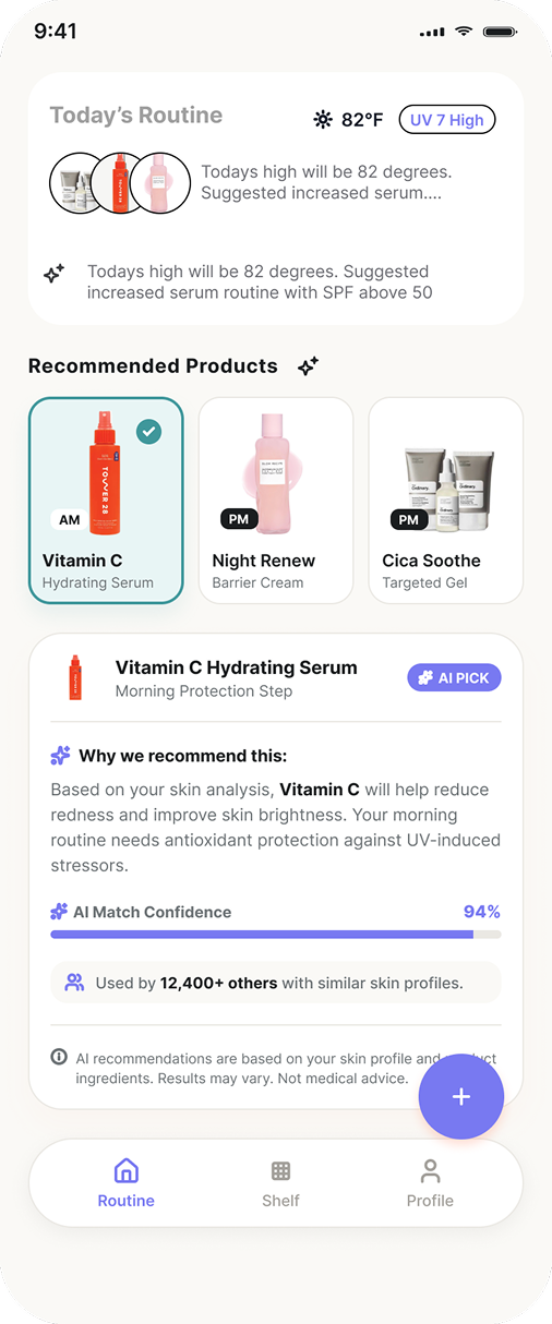
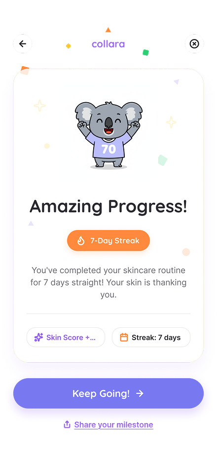
Setting up skills in Cursor to eliminate drift
I built a Cursor skill that treats Figma as the single source of truth, then audits the whole repo against it, catching anything that's drifted before it ever ships.
Hover to preview the skillImpact
Increase in user product input and retention.
Increase in onboarding data collection.
LLM readable design system
I used token architecture to define consistent output and eliminate drift with our AI.
MVP definition
I worked with founders and engineers to go narrow on our MVP and define crucial UX.
Problem and opportunity space
Challenges
Not clarified MVP and no data funnel
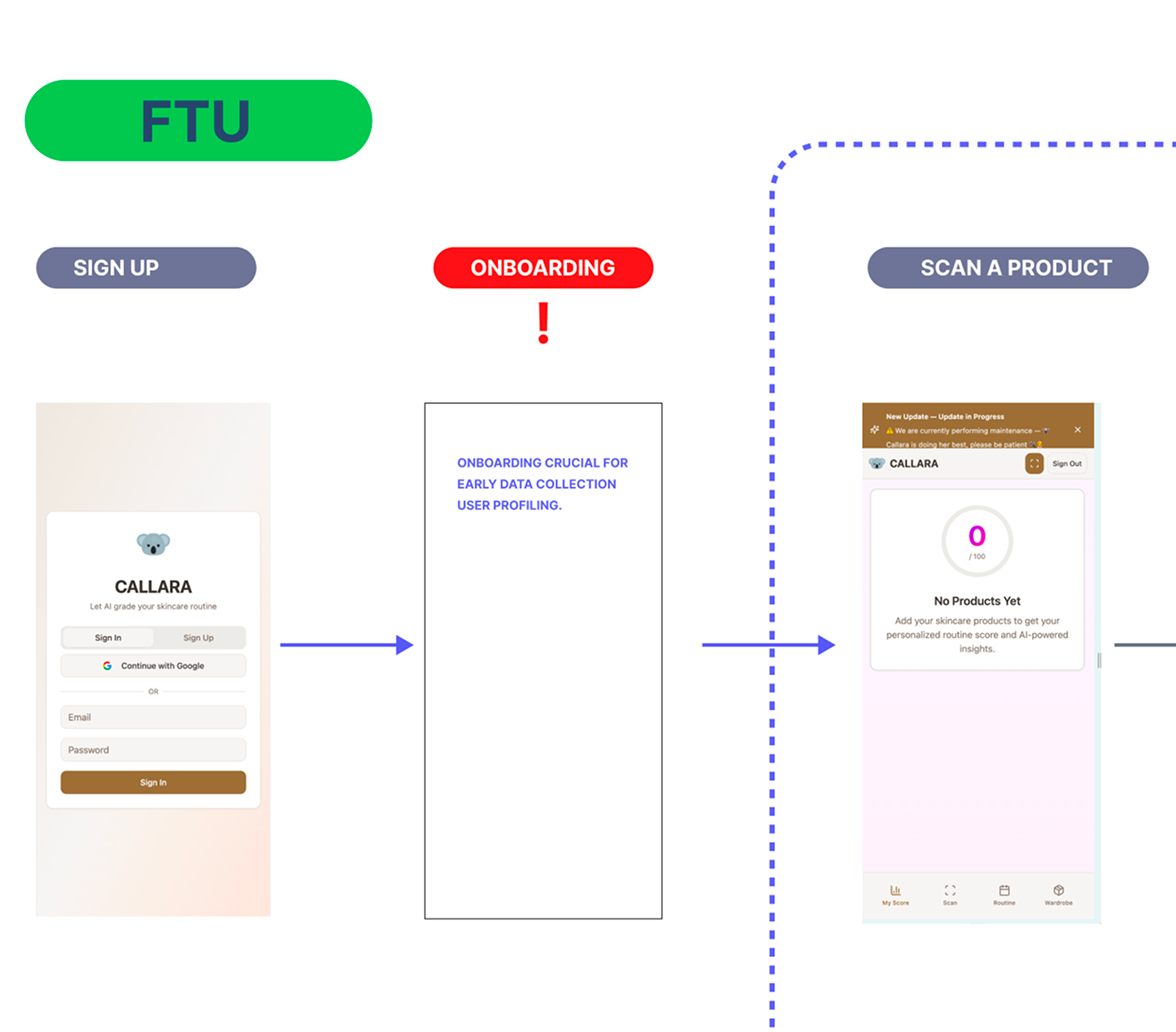
Not clarified MVP and no data funnel
The initial prototype was based off of large user assumptions that had not been validated.
I pressed founders during these conversations to aggresively validate, and remove features that werent crucial to their north star metric.
We defined user product input as the main litmus for product health, and prioritized our features around this experience for phase 1 rollout.
AI prompted design caused drift
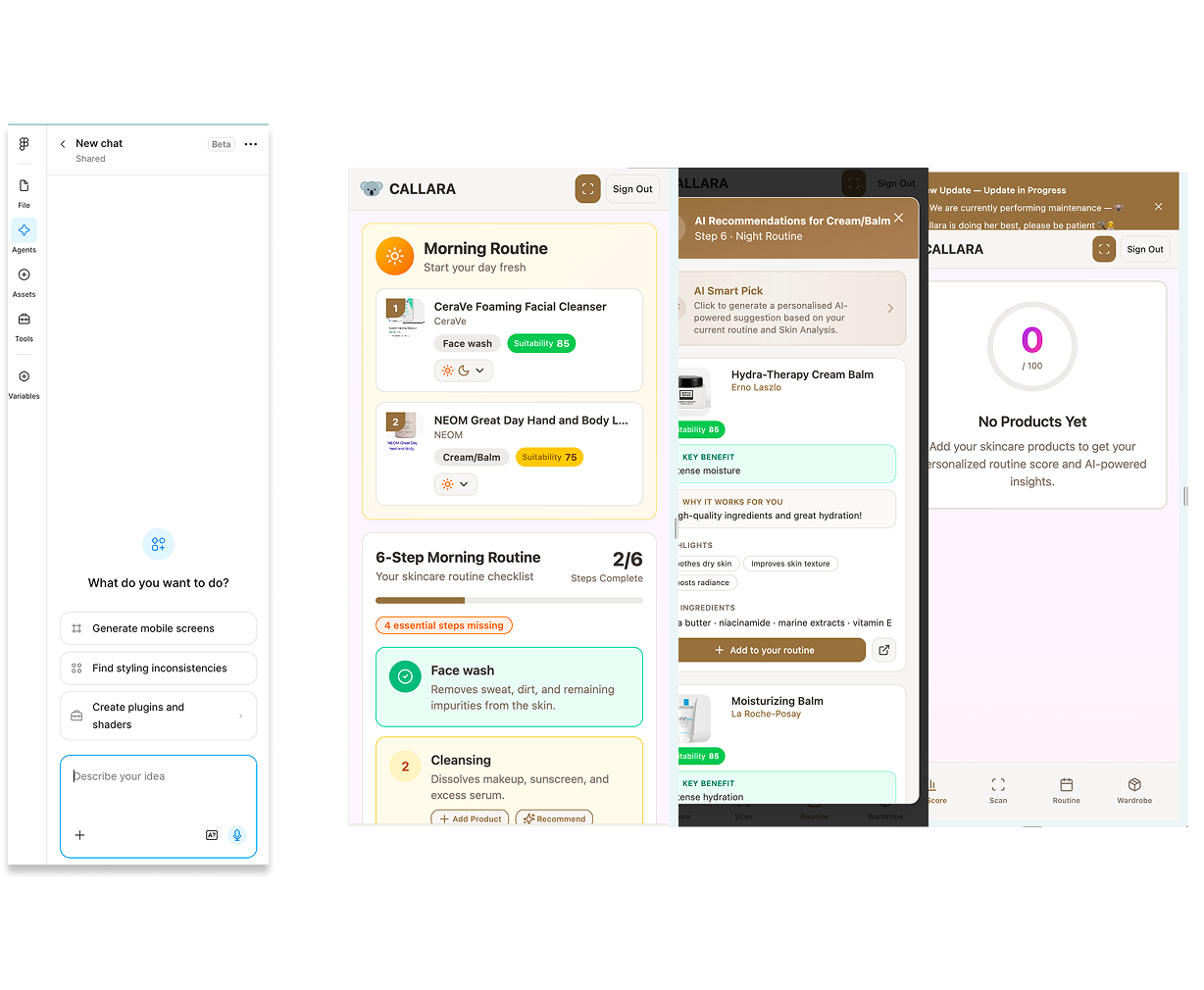
AI prompted design caused drift
Callara's team initially had vibecoded their prototype using generative prompts in Figma make. The problem with this was that there was endless drift everytime a session was initiated.
Their prototype was very crude and fragmented, with no distinct branding, components, hierarchy, user states, or AI guidelines.
Product vision
Initially, Callara wanted a chief-of-staff AI partner with dozens of features. I pushed back on this and brought influence to help narrow their MVP to a solid feature and problem they could solve better than anyone else.
Since their revenue model depended heavily on product input, I documented a hypothesis and a strong argument to focus on product input as a feature.
We could only achieve this if Callara's profile accuracy was strong. I decided that onboarding was a primary objective before designing our core screens.

Onboarding was crucial to gather data and improve AI accuracy for product recommendations.
Initial designs, foundations and interaction
After gathering data and user research from our founders, I put together a product vision with design principles to help guide our metrics and jobs to be done.
For initial design direction, they requested a modern but cute tone, acting as an AI skincare coach.
I did heavy research into which AI tools would be best suited for quick iterations, and how we could streamline AI production without burning through too many tokens, while keeping parity with the design foundations we had in Figma.
Once these metrics and goals were aligned, I started drafting wireframes and foundations for our LLMs to reference.
Foundations → semantic tokens
Foundation spec
L'Oréal
Midnight Serum
Unable to identify
Needs verificationSemantic tokens
Design principles
AI guidelines strategy
I decided to draft an AI guidelines document to keep guardrails in place, and create a seamless user experience around how AI should be surfaced and how it should use customer data. Users have a profound initial distrust of AI. We found it was paramount for momentum and retention in the prototype to display AI's confidence level and its likelihood of failure. Graceful recovery states were essential to keep momentum in the experience. I applied this thinking to all of our design decisions during meetings.
What I shipped